Friday, March 30, 2012

some of my favorite things from CC101

I was blessed this week with a new stove from our landlord, not only is it new, it coordinates with our refrigerator and it has a convection oven, to say I am in heaven is an understatment.  One of my other passions is cooking and this is a fine tool.  So I took all my favorite things from CC101 and did a thank you card for him.  I took the schematic off the back of the old stove and a tag, scanned them in and then printed them out to use as background and embellies.  Took pic of old stove - top and one of new stove - bottom. The thank you is from a StampinUp stamp and secured it with one of Tims pins. Distressed, distressed, distressed and cut out two cogs from TH Die.  Fun, fun, fun. Hugs

Happy Friday Every One!

Engage - to be committed or supportive of:  This is a card I started playing with this week, I used Distress Crackle "Stream", the font is "Ransom" by Sizzix, striped background paper "My Minds Eye" Lost & Found". The flourish background created using Ranger Stains and Distress Inks, Flourish was done with a large foam block stamp.  The "Birds" are from a Tim Holtz stamp and the Spellbinder's block was crackled as well. EKSuccess photocorners also crackled and were placed behind the block.  Inside card says, "Engage in Trust, Love and Forgiveness for a peaceful union", it works whether you are in union with yourself, another individual, or the world.  I wish everyone peace today and throughout your weekend. Hugs

Thursday, March 29, 2012

Day 9-Perfect Pearls Splatter

Today over on the Tim Holtz online class we played with Perfect Pearls, I have to admit I was a little under whelmed when I saw this day on the calendar, I have already gone through my perfect pearl period and did not think I would walk away with much, oh me of little faith, lol.  I love the spatter technique he did and that is the first thing I went for after viewing.  Now, here is a little story about me, when I was a wee one, we lived in house that had a shale and I think it was gypsum or some shiny stone like drive way, my mother would sit me on a pillow because I would sit for hours and play and stare at the shiny in the drive way, my favorite stories were stories that had shooting stars, twinkly stars in them, that has followed me throughout my life, I love sparkle.  As this tag started getting its layers, it more and more looked like one of the pictures sent back from the satelites of the star nurseries, I have taped some of the shows so I can go back and just stare at these images, they fascinate me and that is what I saw in this tag, so this is what I am sharing today.  I used the stains on my craft sheet "Spun Sugar" and "Wild Honey", the flecked in perfect pearls of gold, bronze and copper.  I pressed my first splatter and then added some "Old Paper" distress ink and misted it for another pass over, then dried with the heat tool and misted with water again and did one more, it is truly the layers that are the basis of this technique, it gives a warm depth.  I then used "Vintage Photo" around the edges, not sure what I am going to do with this background, I will let you know.  Happy  thoughts for a great Thursday, I think we get to go through this day in Norther Cal sans water, yippeee, Hugs

Wednesday, March 28, 2012

Reverse Resist

 This morning as I am watching Day 8 of Tim Holtz online course and he is using my favorite mediums, paints and stains, oh my!  I loved a resist techique he did with the White Picket Fence Stain, which I do not have, so I let it go, then Gesso popped into mind, now when I am working out a technique in my mind, I have this process of arguing with myself for a while and since Gesso was originally created to give paint a surface to cling to, I was warfing back and forth.  I use a product called Leather Like Book Cover, I get it at my paper distributor and it is used mostly a corporate enviornment to do training manuals, proposals, etc.  It is basically a treated heavy cover stock and texturized to have a leather like appearance, it comes in white and black and is a semi gloss paper.  So I finally decided to try it.  So I am calling this a reverse resist because it is the coated paper that is resisting and the gesso is taking in the color.  The trick to this is layering of colors and products, I used the stain "Wild Honey" and "Walnut" heat set it and then buffed it, then airbrushed it and buffed and then my final coat was "Barn Red" distress pad.  This will be used as a book mark.
This is a side view so you can see the gesso was laid on as heavy as I could go without losing the detail.  I am so loving combining my airbrush and copics with the Ranger Stains and Distress Inks, who would have thunk?  Hugs

Oh My Butterflies

I am one happy camper with the Ranger Ink "Rock Candy" Distress Crackle.  This was one of Tim's   techniques for Day 8. This stuff is amazing.  The above is a finished butterfly, below is a short progression of the project.

 This is a large Ellison Butterfly Die, approx meas. are from widest width wing tip to wing tip top is 5 1/4" and from wing tip to wing tip top to bottom is approx. 3 1/2", I cut it from heavy white card stock and chipboard and adhered.  Then I cover with a medium coat of the "Rock Candy" and let it dry on its own.  I then used the Distress Stains, "Wild Honey, Vintage Photo, Spun Sugar and Green Shutters.  Since I did not have any blue in the stain, I airbrushed with the blue with Copics, OH WOW!  I then applied another coat of "Rock Candy" and let it dry.
 blurry close up of wing tip.

Then when second coat of Rock Candy was dry, I stamped with black archival and an old Stampin Santa Rosa Butterfly Stamp.  The top pic shows the addition of the beaded atennae.  I now have some new ideas, LOL.  Have a fantastic Wednesday, Hugs

Tuesday, March 27, 2012

Froggie Birthday

Day 7 with Tim has been a nostalgic trip indeed.  I forgot how much I loved the Ranger Distress Embossing Powder, it has set in my drawer, in the back, dark, forgotten.  When these first came out my favorite thing to do was to create backgrouund blocks with the powders.  I swipe the block with the ink but intentionally miss places, dust with the powder "tattered rose", set it and then go in with the distress inks and as you can see on the bottom then flicked with water.  The block and the frog are both mounted to chipboard.  The frog was also done with the "green shutter" powder but after setting it, I then sand it to remove part of the powder and distress with the pads. His eyes are black gems, with just a dot of white to bring them to life.  The sentiment is from Brenda Williams.  The photo corners are cut from embossed tin foil and then airbrushed with copics. Card Stock is Bazzill.  I apologize for the dramatic slant on the card, we are overcast and dark grey in No. Calif. today and the house is lite like a cave and this is the only way I could get close to true color.  Happy Tuesday, Hugs

Monday, March 26, 2012

Magic resides in the Creative Process

Happy Monday, hope everyone had a good weekend, other than a horrific allergie attack on Saturday, I had a good one.  If you are having allergy weather where you are, you might want to consider going to your local health food store, buy a jar of local, raw, organic honey, at the first sign of allergies, take a spoonful every 2-3hrs, as the symptoms begin to reside lessen the honey intake to twice daily until all symptoms are gone,  I have very few symptoms today and probably with cease the honey intake by tomorrow, if you suffer consistently with allergies, you might want to go ahead and do maintenance throughout the season with a teaspoon to a tablespoon every morning.  Also remember that honey is an awesome topical for coldsores and that dry cracked area around the nose, it will take a cold sore out in less than 24hrs. I took my down time on Saturday to do some review on the Tim Holtz classes, wow they are really good and I will have them archived for future viewing, so glad I made that decision to sign up.  This was one of his techniques, flicking water on the blended distress inks.  Hugs

Saturday, March 24, 2012

My version of Craft Resist Paper

 Why, do I do this?  I think the primary reason is I have no patience, I live in a very conservative area and the buyers for the craft industry here seem to wait for a least 6mos. to order new product, I think they wait to see how other areas do with it before ordering, (makes me crazy), so I do a lot of on-line shopping and when I get an idea, I want to run with it.  The other reason is that, as with this line, it does not always come with what I am looking for in a design and I want the option of doing my own.  Heaven knows, I realize the importantce of supporting the industry and I more than do my share, LOL. I do have this product on order, it is just not here yet.
 I took waterbased ValSpar and with a large brush, just did sweeping lines, I did not give this hope for much success and was actually surprised that it worked right out on first try.  I did heat set it with the heat tool.  I stamped my image first, then applied the ValSpar,  then used the Distress Inks to color.  I then stamped and cut out one of the butterflies and used the "Tattered Banner" Tim Holtz Die for the sentiment.  Distress inks used were: Mustard Yellow, Spiced Orange, Broken China and "Tea Dye" pad.
 another close up of the VelSpar.  I will next use the ValSpar directly to a decorative background stamp and see how that works, I will let you know.


Here is the process, using the Val Spar directly to the background stamp, I used a written words stamp and the Val Spar was a little too runny for this process, so next time I will use a different stamp or figure out a way to get a lighter coat applied.  I used the "Tim Holtz" Wild Flower stamp set and I love that sentiment. It was mounted to a Stampin Up punch.  I did a very light wash of gesso and then wiped it with a paper towel.                                                                                                          

this is a side view so you are able to see the resist.   A little tip, you want the Val Spar to dry completely on its own before you heat set it or you will get some bubbling, it really didn't matter on this card, in fact it gave it a little more definition of being antiqued.

Happy Weekend. Hugs

Friday, March 23, 2012

Garden Bounty

Two posts today, I could not resist sharing my garden bounty.  I love love love Camellias and my little tree is just loaded wtih buds, oh yippeee!  I always feel so blessed when my garden graces me with blooms, butterflies or dragonflies.  I wish I could hand each one of you one of these beauties, but this will have to do. Hugs

Tim Holtz On line class

Happy Friday everyone, this time last week I was getting ready to leave for Las Vegas, hard to believe.  I hate that Christmas morning after feeling when you get home from a smashing wonderful time, the routine is so hard to embrace again.  What I have learned to do over the years is to schedule some fun things for after I get back.  When I saw the Tim Holtz class, which began the day I got home, I knew that it was a must do.  I have not been disappointed.  Although I have taken various workshops with him in person, I never tire of his enthusiasm and his passion for his processes.  I love the new products and that White Picket Fence is absolutely on my "must haves" list.  I did not have the spray stains and washes so I used what I had on hand for this tag and it worked out okay, but the sprays I used do not have the interactive properties of the Ranger Inks and dyes, so I had to manipulate them more than you would with the Ranger products.  The stamped images are from Tim's line and I did do a distressing on the edges with "Tea Dye". Have a safe weekend.  Hugs

Wednesday, March 21, 2012

I am home!

Hi All, I got home 9PM on Monday, after almost 4 days of NO SLEEP!  It has been along time since I have had such concentrated FUN.  We talked and talked and talked, although we manage to keep in touch most of the time, we have not seen each other in about 8 years.  We have been friends for 25 years.  We enriched the wine industry of California, we saw the most wonderful show "Menopause" by Jeanie Linders, if you ever get the chance to see this, no matter what your age, do not pass up the opportunity.  We hit the stamp stores, we cooked, we ate out. I met a slew of her wonderful new friends and was pampered in her beautiful new home.  We pulled a couple of nickle slots but I was just not concentrating so no wins this trip.  We did the cruise of the strip, boy did that blow someone away that had not cruised the strip since the 1970's, like being a different town it was.  The card is just a smidgen of the thank yous I hold in my heart, but it was a fun one because it corporates many symbols of our trip.  The base of the background was colored with Bitters, yep the kind you use in a mixed drink, because she introduced it to me for my Perrier, which I drink a lot of.  The hearts for my heartful thanks, the clock because there were none in Las Vegas.  The peacock blue for a funny funny thing that happened on our drive from LasVegas to Long Beach on Monday.  Beading string attaches the clock to the tag, represents Jeanie Linders, a wonderful woman who is committed to empowering woman all over the world, yeah! Jeanie.  So this is my thumbnail of LasVegas, I hope that everyone is well, safe and happy, today and tomorrow.  Hugs

Wednesday, March 14, 2012

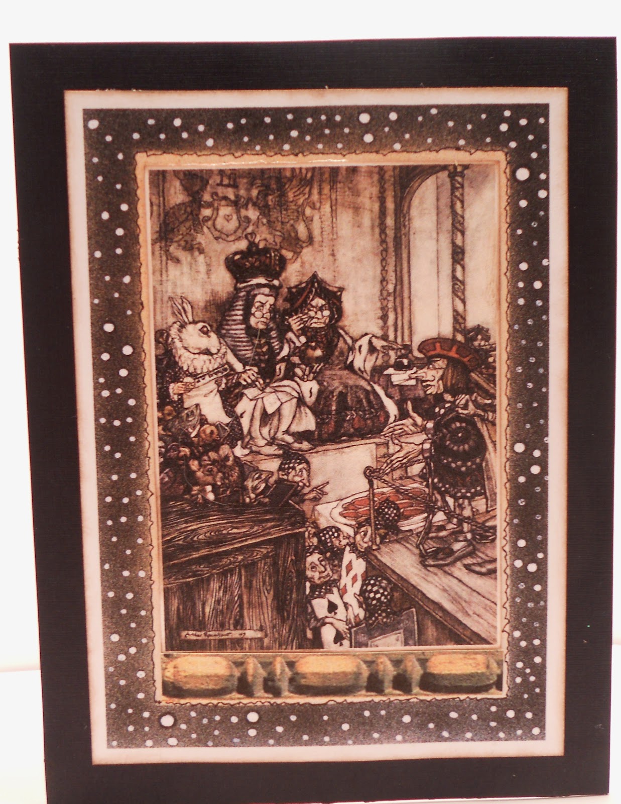
Christy's Art/Smash Journal with Steampunked Alice


It is finished and presented to Christy and she liked it. This was so much fun to play with, I got a lot of Copic time on this one.  My focus on this was to keep it simple and not to set the theme.  Christy has a son, daughter and husband, so I wanted her to be able to express all of them in this journal.  I chose the Steam Punk with Alice cause it just seemed to fit.  The Alice on the cover is from "Graphic 45" Halloween Alice, I cut off her witches hat and added a hat from an Inkidoo "SteamPunkedSkull".  One of my favorite things in the entire journal is the pin on the cover, I really wanted one of the plain tag pins but could not find any where here or online, so I made one.  The pin prick protector is a piece of cork from a wine bottle, the "C" was fortuitiously already there.  The ceramic journal piece has been in my stash forever and I cannot remember who is responsible but I like it.  I posted 2 close ups of the pin.  Then I posted three page sets that I liked,  the shilouette was cut from chipboard and then I added a little tuck in pocket and added a tag. The second page set the little card on the right is hard to see but in the left bottom corner it says (recipe) and is from a "Stampin Up" set, the light bulb is from "Spellbinder's" and the 4 is also a "Spellbinder's" font.  The flower is from Cricut "Plantin Schoolbook" cut in 3 sizes and held together with a brad. The last page posted and last page in the journal, 3 coin envelopes colored with copics.  The clock is from a travel cd.  The key is an "Ellison" die as are the 3 tags (you only see 2 the 3rd is tucked between the flap and back to hold it in. The overall size of the journal is 7 1/4" x 5 1/4".
Hope everyone has a wonderful Wednesday, you will not see any posts from me til I return from the "Biggest Little City" in America, I am off to Las Vegas on Friday and will back late Monday evening so stay safe and happy and play nice.  Hugs

Tuesday, March 13, 2012

Making your own Kraft Glassine Paper

This is the finished card, the Spellbinders plaque is the Kraft Glassine Paper, I printed
the BasicGrey Digi Paper "Euphora" on it before distressing.
It always starts out so innocently.  I have a pot of pinto beans on the stove, getting all food ready for Michael before I leave on trip.  I have wash in the washer, getting clothes ready and I have a few extra moments, so I come to the computer to print out my supply list for the Tim Holtz "Creative Chemistry 101" online class starting March 19, if you have not heard of it, you might want to check it out, I love his philosophy, I love his sense of style and I love his abandonment into his art process.  One of the items on the supply list is Kraft Glassine paper but when I start looking for it, I don't find it, I can find the 12X12 printed sheets but not the 5X7 plain sheets.  So I decide to go to UTube to watch his kraft glassine video, okay here is where the trouble starts, ROFL.  As I am watching this, my brain is going okay how do they make that paper, stop video and start it over again, need to pay better attention, I have heard him several times in different videos say that this is not wax paper it is kraft paper, true, but that treatment has to be a wax substance of some kind.  Then "soy" wax pops into mind, then "I wonder?"  So I go cut a piece of craft paper, I have melted soy on my candle burner already melted down, I grab a plastic scrapper and a foam brush.  If you are going to try this, I suggest an 8 1/2 by 11" sheet or 5X7" then after you get it down go larger.  Place the sheet of craft paper on a protected area, weight down the 4 corners, then dribble the soy wax over the craft paper as if you are icing cinnamon rolls, covering as much area as possible, but don't sweat the uncovered areas, we will get to that.  Now give the soy wax a minute or so to dry, with your plastic scrapper remove the wax from the paper, (don't throw away the residue, put in plastic bag for future use).  Now take a heat tool and heat the wax on the paper until it is wet looking and with your foam brush spread it evenly across the entire sheet. While it is still wet take a paper towel and remove the excess, do this process 2 or 3 times (just the heating and wiping part). You are done, now if you do not know how to use the paper, go to UTube and watch his video on it, amazing.  I would not suggest you use this hand made paper on scrapbook pages and I am not sure if the store bought is archival safe, you might check that out.  I have posted 4 pics, showing the materials and the finished project.  Happy Tuesday, must get back to my pinto beans. Hugs


This is a close up of the plaquard. I distressed with "Lipstick red, green shutters and straw"


These are your basic tools, forgot to show the paper towels and heat tool

I included the shot so you could see the natural kraft paper and also the transparency of it, all I had was Christmas Kraft Paper, but it worked perfectly.

Sunday, March 11, 2012

last sneek peak and tip for Sunday

So, every Journal/Smash Book must come with some stash to play with and this one does.  I did not want to put it in a clear bag or a gift bag with handles, I wanted a proper paper bag.  So I started playing with some templates.  Last week I ran into Starbuck's and got one of their Blueberry Oat Bars (love those things) and the bag was laying on my craft table, hmmmm, it was the perfect size just needed to be a little longer, so went to work and made a template and I really do think I love this bag.  Over all size is 6 1/2" X 8" and there is a 1" gusset on both sides. I might do a tutorial later on, this coming week is spoken for, LOL.  The label on the bag "Spellbinders" with a "Nice Crane Designs" illustration from Alice.  I thought the Knights mixing color was perfect.  Background sprayed with Copics and airbrush. Contents?  That will remain a secret for now, Miss Christy.

My tip for the day, when I am putting my journals/memory books together, one of the things I fret over is the placement of pages, I punch the pages as they are done and keep them on a 2" binder ring, this way I can move them to and fro until I am satisfied. Did you move those clocks forward? Happy Sunday, Hugs

Saturday, March 10, 2012

Spray Sheet

I have been using a spray sheet for my journal page spraying, it is a pretty controlled spray.  I take my paper, in this case 5"X7" and draw an outline around it, I then run my re-positionable glue stick inside the outline, then I attach my journal page, this way it is not going to fly off or be sprayed underneath.  I have been changing the sheet about every 5 or 6 page, intermittently I also will spray an embellishment or two.  And every once in awhile the spray sheet will gift me with a surprise.  I especially liked this one, so I cut it out to 5"7" and then scanned and printed it out and used it in the journal.  Happy Saturday!, Hugs

Friday, March 9, 2012

background papers-another sneek peak


When I started out doing Christy's art journal/smash book I decided I did not want to use double sided papers, after I got them all chosen and cut, I then did not like the stark white.  So I decided to airbrush the backs, ROFL, what was I thinking was my first thought, then as I got into it, I LOVED it.  It gave me some great time to work on some techniques and has given Christy's journal/smash book that individual look that I was going for.  Also once I got into it, it did not take as long as I initially thought it was going to take.  All of them are not scenes, some are stamped, some are stenciled.  These were done with the Copic Airbrush and markers. I know the top one looks a little unworldly, I have been watching too many Science Documentaries, LOL. And don't forget, when you do do that background paper and you have one that you especially like, remember to scan it in so that when the opportunity arises to use it again, you don't have to re-invent the wheel.  Below is a card done with the 2nd background paper.

The card is a standard A-2 card, the background is from the one above, I just printed it out in a smaller format.  The Alice piece is from "Nice Crane Designs".  The little wooden piece is from some architectural items I have in my stash. 

Hope your Friday is Terrific. Hugs

Thursday, March 8, 2012

Snuggle-A thank you card

I know at first glance this looks like a baby card, lol, I did it as a thank you note to accompany my hostess gift for a trip in mid-March, I am giving the hostess a wonderful pair of pink fluffy slippers and I thought this was fun and sassy to go with. She is in a high profile, high stress occupation and I love gifting her with things that pamper.  The background papers and booties are a new release by the fabulously talented Barbara Williams at "Cuddley Buddley" entitled Wee Ones, these papers are fab, in every color imaginable.  The ribbon and charm are from my stash.  The brown hearts are from her recipe paper "Alonzo's Kitchen"

I did the inside of the card with coordinating papers, digi's lend themselves perfectly to this concept.  That's it for today, I am off to try on swim suits and shorts for my upcoming trip, LOL ( I have lost weight but maybe not enough, we will see). Have a great Thursday. Hugs

Wednesday, March 7, 2012

Pocket and Tag

This is a pocket and tag I made for an ongoing project.  I promised my friend Christy I would do an art journal/smash book for her.  So this is a sneak peeek, so she can see I really am working on it.  The art blocks are from "Nice Crane Designs", the pocket is a standard library pocket that was distressed with Tim Holtz distressing inks.  The tag was created with washi tape, there used to be a cool UTube demo by Tim on how to do them, it's been awhile so I don't know if it is still there.  The lock and key is from an old EKSuccess embellishment I had in my stash.  Eyelash cord for the tag and also used an eyelet, wow pulling out all the old tools for this.  Nothing like a project to get your supplies out and used.  Happy Wednesday, hugs
 

Monday, March 5, 2012

Monday, Monday, Mermaid

Krista Smith, Basicgrey, Spellbinders, Cuttlebug and Copics, what a team. I wanted to keep this simple, I love this mermaid, one of Krista Smiths digis.  The Spellbinders scalloped oval was given my gel medium treatment and then embossed with a fun folder from Hobby Lobby by Darci.  You can see the sheen right top of the oval, I embellished with a few round gold dots and cut one for her belly button.  The pearls in her hair are Higgins White Ink.  Hope everyone has a wonderful start to a new week. Hugs

Sunday, March 4, 2012

Sunday-Tip of the Day

I was deeply impacted a month or so, I was watching a documentary on the Science Channel, I think it was "Brain Test" or "Brain Teaser" and it was on the optical illusions the brain produces.  They stated that we do not see with color, we see with shadows.  I sort of knew this but it had never been stated that way.  My very first art class, I think maybe the 9th grade because that was the first year we were allowed to choose an elective class and I chose art.  First day our teacher informed us that for the next 3 months we would be drawing with pencil only, no color, no medium, pencils only and I was at first horrified, no color?  It was probably one of my most formative classes ever, it made me look at shadows, it made me realize that there are a million shades of gray between black and white.  Our brain uses those shadows not only to define but to position and gain perspective of where the object is in relation to ourselves.  Wow, I have been on a shadow quest and playing with my Copics in a whole new way.
Now, does this card have photo corners applied?  Well yes, but not dimensionally, they were airbrushed in, creating a deep shadow and then the bottoms were line drawn with brown, which creates the illusion that there is another dimension on the paper.  So if you ever hear that you see in shadows not color, believe it.  Happy Sunday, Hugs

Saturday, March 3, 2012

A Graduate

This card is for an engineering grad student from Cal Poly.  It was really a fun card to make.  The papers used are from one of my favs, Graphic 45.  The stamped imaged are from Eco Green Stamps, "Steam Punk Accessories 1".  The banner is from the Tim Holtz  die "Tattered Banners" and the words were computer generated.  The screws in the corners are also from the Eco Green stamps.  Colors were done with Tim Holtz distressing inks and Copic markers.  Hope everyone has a great Saturday. Hugs

Friday, March 2, 2012

Happy Birthday

Happy Friday, this cute little image is from LoopyLou, "Cute Girlie", I think she is adorable.  The background paper is mine and the oval was treated with gel medium and then embossed, it has a slight sheen to it, not picked up by camera.  The sentitment is computer generated and the plaquard is by Spellbinders.  Prima flowers and little gems for the center.  Colors by Copics.  This is a standard A-2 card.

Thursday, March 1, 2012

Basic Grey Euphoria Digis

Oh BasicGrey how do I love thee, let me count the ways.  LOL, when I saw this digi set, I could not resist, they are classic, sassy, tailored yet shabby, love em.  So I printed out D803 element on 8 1/2"X11", cut it in half so then I had two A-2 cards, I still have another one to play with, it is darker.  Then I printed out the flourish #7 at 50%, cut it out and colorized with the Copic markers.  The sentiment is from Barbara Williams Collection at cuddlybuddly  And that is it, easy, peazy for an elegant note card.  Happy Thursday, Hugs